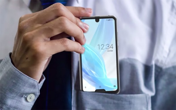
If there’s one thing Android users love, it’s the notch. That’s why diehard Android fans were so excited when just about every smartphone maker on the planet decided to copy Apple’s iPhone X design earlier this year.
Just in case it wasn’t clear, we’re being sarcastic and hardcore Android fans have historically hated the notch. Apple wasn’t the first smartphone maker to cut a notch out of its display, of course, but it was the first to use the notch design seen on the iPhone X. And of course that’s the design every Android phone company decided to copy, for obvious reasons — if Apple does something, they have to do it too. The worst part is they copied the design for no practical reason. Apple only needs such a large notch because of all the components in the TrueDepth camera system. Android phones don’t have complex 3D face scanning features, so all along they could have been using a much better and smaller notch design like the one on the OnePlus 6T. But hey, then they wouldn’t be copying Apple!
Of course, some companies aren’t content with just copying Apple, and on Thursday Sharp decided to turn things up a notch. Sadly, pun intended.
BGR Top Deals:
- It’s true: Bose makes a sound bar you can actually afford
- Philips Hue is having an early Black Friday blowout sale on Amazon, today only
Trending Right Now:
- Russia says it’s going to beat Elon Musk and SpaceX’s ‘old tech’ with a nuclear rocket
- Leaked photos show Apple’s next-gen AirPods for the first time ever
- Astronomers may have just spotted a ‘super Earth,’ and it’s not far away
It’s finally here: This is the ugliest smartphone in the history of smartphones originally appeared on BGR.com on Thu, 15 Nov 2018 at 08:46:28 EDT. Please see our terms for use of feeds.
Read more here:: Boy Genius Report

